Hack The Tunnels'24 - Carleton Central Website Revamped
Monday, October 28, 2024


Project Guide: Redesigning the Carleton Central Website
Overview
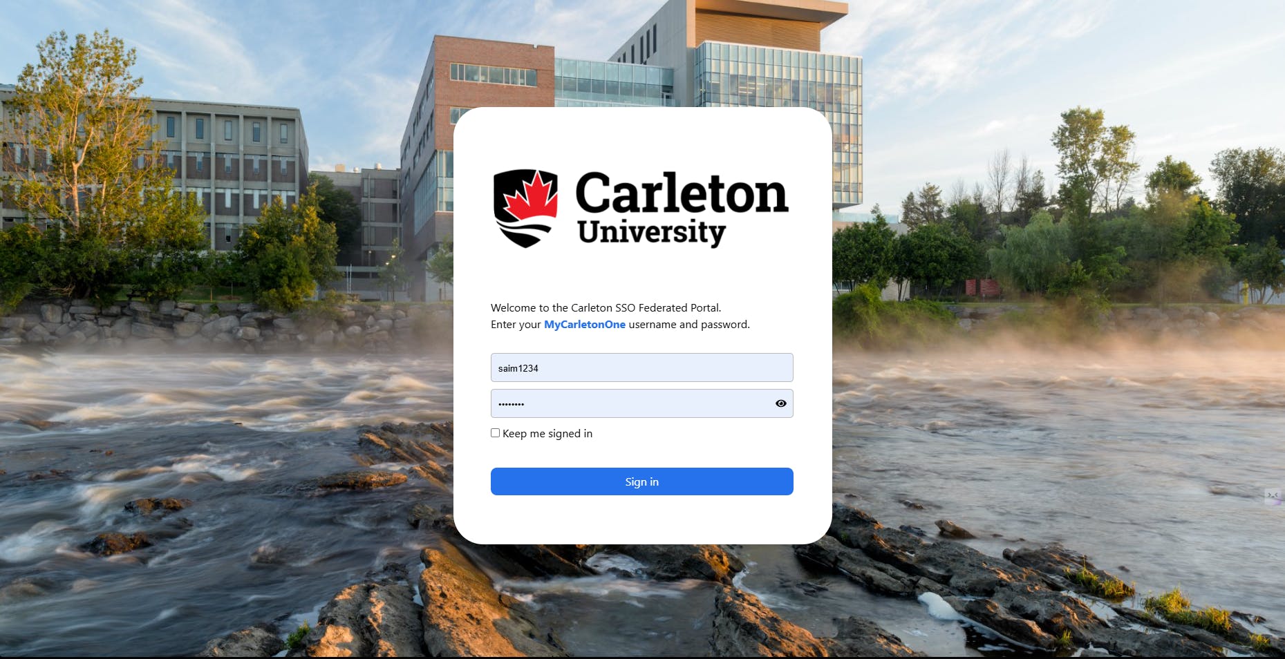
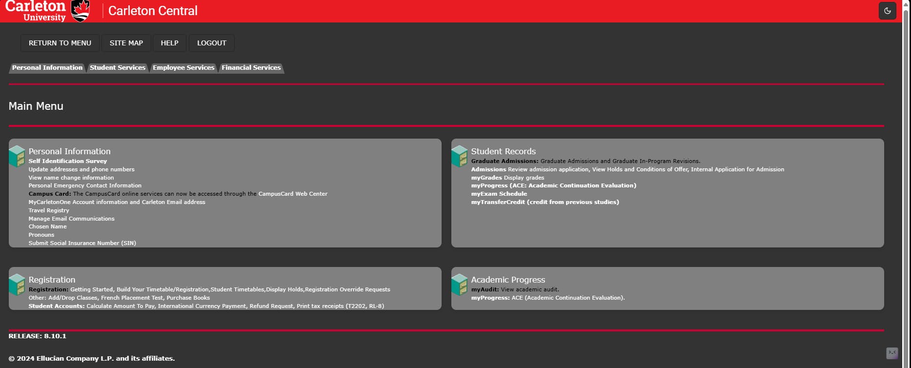
At Hack the Tunnels, our team took on the ambitious project of redesigning Carleton University's Carleton Central website to improve its user experience and accessibility. The current platform, while functional, presents challenges in navigation, responsiveness, and design consistency. Our goal was to reimagine the website with a modern, user-friendly interface that addresses these challenges.
Stage 1: Identifying the Problem
1. User Research
We began by gathering insights from students, faculty, and staff to identify pain points with the existing website.
- Surveys and Interviews: Conducted quick surveys with peers to understand common frustrations.
- Key Findings: Complex navigation structure. Cluttered and outdated interface. Limited accessibility features. Non-intuitive mobile experience.
2. Competitor Analysis
To draw inspiration, we analysed similar university portals:
- Focused on platforms like uOttawa’s ozone and McGill’s MyCourses.
- Noted design trends such as centralized dashboards, streamlined navigation, and mobile responsiveness.
Stage 2: Brainstorming and Ideation
1. Defining the Scope
Our redesign prioritized the following:
- Simplified Navigation: Grouping related functionalities.
- Personalization: Dashboards tailored to user roles (students, faculty, admin).
- Mobile-First Design: Ensuring usability across devices.
- Accessibility: Adhering to WCAG guidelines for inclusive design.
2. Creating Personas
We developed personas based on our research:
- Samantha: A second-year student accessing grades and course schedules.
- Alex: A professor uploading course materials and managing student lists.
- Marie: An admin staff member monitoring financial record.
These personas guided design decisions to ensure a user-centric approach.
Stage 3: Prototyping and Wireframing
1. Low-Fidelity Wireframes
Using tools like Figma, we sketched basic layouts:
- Homepage: Central dashboard with personalized quick links.
- Menu Bar: Categorized sections (e.g., Academics, Finances, Resources).
- Responsive Grid: Designed layouts to adapt seamlessly to various screen sizes.
2. User Feedback on Wireframes
We shared our wireframes with peers for feedback:
- Suggested adding “Quick Actions” for frequently accessed features.
- Highlighted the importance of a prominent Search Bar.
Stage 4: UI/UX Design
1. Design System
We established a cohesive design system for consistency:
- Colour Palette: Carleton red and white for brand consistency, complemented by neutral grays.
- Typography: Sans-serif fonts for readability.
- Icons and Imagery: Minimalist icons and high-resolution images.
2. Accessibility Features
Incorporated features like:
- High-contrast mode for visually impaired users.
- Keyboard navigation for better usability.
- Screen reader compatibility.
3. High-Fidelity Prototypes
Developed detailed prototypes with animations and interactive elements:
- Integrated a Calendar Widget for tracking deadlines.
- Introduced Notifications for personalized updates.
Stage 5: Development and Testing
1. Tech Stack
We proposed a MERN stack (MongoDB, Express, React, Node.js) for its scalability and flexibility:
- Frontend: React with Tailwind CSS for rapid styling.
- Backend: Node.js APIs to fetch and display data dynamically.
2. Agile Workflow
Split development tasks into sprints:
- Sprint 1: Setting up the environment and developing reusable components.
- Sprint 2: Implementing core features (navigation, dashboard).
- Sprint 3: Testing responsiveness and integrating user feedback.
3. Usability Testing
Conducted testing sessions with real users:
- Collected feedback to refine navigation and improve feature placement.
- Resolved bugs and enhanced page load times.
Stage 6: Presentation and Reflection
1. Project Presentation
Our team created a dynamic pitch:
- Showcased before-and-after comparisons to highlight improvements.
- Walked through the redesigned interface using live demos.
2. Takeaways
- Collaboration and iterative feedback were key to our success.
- Learned to balance creativity with technical feasibility under time constraints.
Conclusion
The redesign of the Carleton Central website during Hack the Tunnels was an exhilarating journey of problem-solving, creativity, and teamwork. By focusing on user needs and leveraging modern design principles, we crafted a solution that improves functionality, accessibility, and overall user experience.